What you sent, and what I built from it
Your three references, then mine, so the gap is visible rather than argued about.
1 · ClyHealth age report
The one you sent from desktop. This is the closest to what you want.
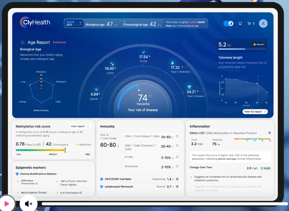
What I took: the dominant radial with satellite metrics orbiting it, and module cards underneath.
What I missed: the hero panel is a raised surface with a real gradient and depth, not a flat card. Every satellite carries an icon. The supporting cards are visually distinct from each other rather than three of the same box. And it is light, warm and high contrast, where mine is uniformly dark and low contrast.
What I missed: the hero panel is a raised surface with a real gradient and depth, not a flat card. Every satellite carries an icon. The supporting cards are visually distinct from each other rather than three of the same box. And it is light, warm and high contrast, where mine is uniformly dark and low contrast.
2 · Server Management Sci-Fi Dashboard
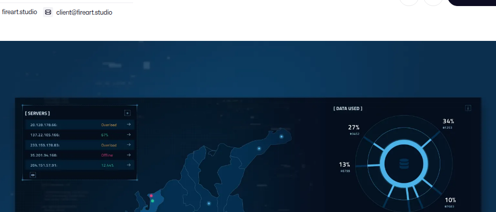
What I took: the fine tick ring radiating outward, the glow, the dark ground.
What I missed: theirs pairs the dial with a completely different element, a map, so the eye has somewhere else to go. Mine pairs charts with more charts.
What I missed: theirs pairs the dial with a completely different element, a map, so the eye has somewhere else to go. Mine pairs charts with more charts.
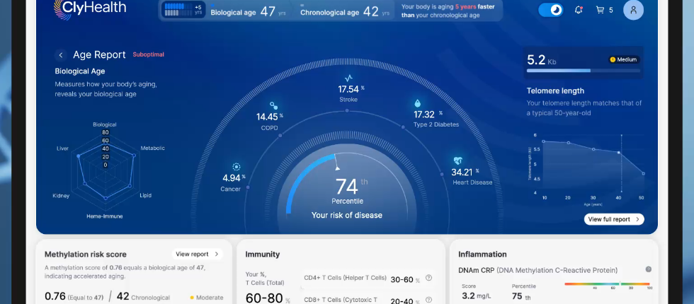
3 · Age Reporting UI
4 · FluxCRM
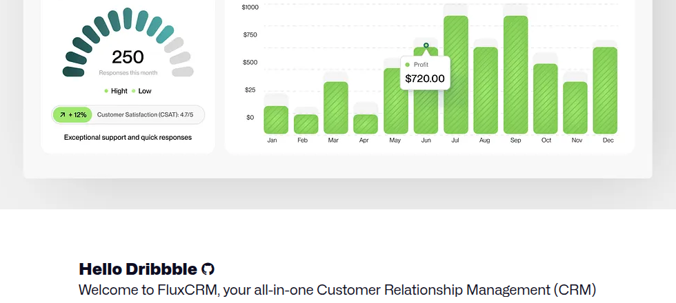
What I missed from both: generous padding and fewer things per screen. Both breathe. Mine fills the frame.
5 · What I built
Retrieval readiness, the static version.
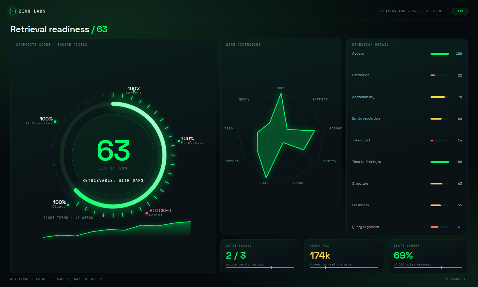
Honest read: the structure matches the references but the execution does not. It is flatter, more uniform, and more crowded. Three panels of near identical treatment, no depth, no icons, and everything competing at the same visual weight.